5 Oct: Intro to task
Initial Ideas
Research chosen genre - Front Cover
12 Oct: Research chosen genre - contents and double spread
Develop Pitch
19 Oct: Pitch
Audience feedback
Style sheet
Planning and Production
2 Nov: Designing front cover
9 Nov: Designing front cover
16 Nov: Designing contents page
23 Nov: Designing double page spread
30 Nov: Develop design work in responce to the audience feedback
7 Dec: Finalise magazine design
14 Dec: Evalutaion Preparation
4 Jan: Evaluation
11 Jan: Evalutaion
Monday 30 November 2015
Monday 23 November 2015
Time Management
5 Oct: Intro to task
Initial Ideas
Research chosen genre - Front Cover
12 Oct: Research chosen genre - contents and double spread
Develop Pitch
19 Oct: Pitch
Audience feedback
Style sheet
Planning and Production
2 Nov: Designing front cover
9 Nov: Designing front cover
16 Nov: Designing contents page
23 Nov: Designing double page spread
30 Nov: Develop design work in responce to the audience feedback
7 Dec: Finalise magazine design
14 Dec: Evalutaion Preparation
4 Jan: Evaluation
11 Jan: Evalutaion
Sunday 22 November 2015
Photography Planning - Models
For my images I am going to use people that I know from lessons and outside of college. I will have contact with my models via Facebook and text messaging.
Photography Planning - Costume
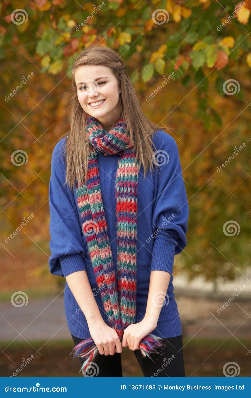
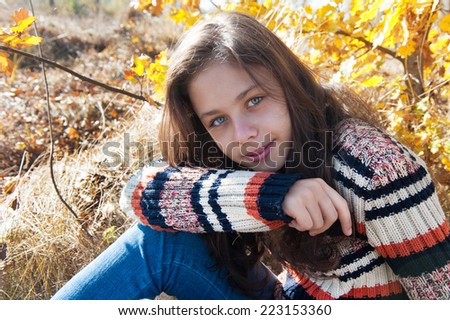
The style of clothing that my models will wear will be current trends and fashions right now. None will be in a special costume or anything very smart or expensive. The overall look will be an average teen look especially as a lot of the pictures will be based on lesser known and new artists. I want the style to be able to resonate with the target audience so they can relate to the magazine giving them a bigger interest. The style will be loosely based on autumn as it is being created in that time of year.

Photography Planning - Body Language/Facial Expression
The central images for the cover, content and double page will be posed and high key. This is so that I can make sure that the images will work well on my pages in the places that I want them. Some of the secondary images for the contents page will have a candid feel to them so that they look natural.
Photography Planning - Framing and Composition
The framing of the images will depend of the layout that i choose for each page. For my central images on all 3 pages I will try the image in central positions and left and right. There will be some white space around the focal point but the focal point will still take up the majority of the space. For the central images there will not be any surrounding objects. I want the images to be of purely the person with a passive backdrop, such as white, brick or nature.
For the secondary images the images will be centred and possibly with some objects in both the foreground and the background.


For the secondary images the images will be centred and possibly with some objects in both the foreground and the background.
Photography Planning - Locations
For my main 3 images I would like my images to be posed on a plain white background or grey, and one on a background that may be bricks or nature. Some of my secondary images will be shot outside in nature.
Potential Places
Potential Places
 |
| White wall would be in the college |
 | ||
Stone wall will be outside of college
 |

Photography Planning - Camera Angle
The camera angle for the central image will be straight on for the double page spread and contents page. This is a general convention of the genre of magazine. I have chosen this angle as it will connote the image of equality especially for sections on upcoming artists.
The camera angle of the cover page image could be either straight on or taken from the left or right, this will add variation to the images.
Head on
Side on

The camera angle of the cover page image could be either straight on or taken from the left or right, this will add variation to the images.
Head on
Side on
Photography Planning - Shot Type
My shot types for the front cover and double page spread are going to be either a close up or medium shot. I will experiment with both and see which is best for the magazine when it comes to placing the image. I have chosen to use these image types as they are used as a general convention of magazines in my genre.
|
| Close Up |
 |
| Close Up |
 |
| Medium Shot |
 |
| Medium Shot |
Monday 16 November 2015
Time Management
5 Oct: Intro to task
Initial Ideas
Research chosen genre - Front Cover
12 Oct: Research chosen genre - contents and double spread
Develop Pitch
19 Oct: Pitch
Audience feedback
Style sheet
Planning and Production
2 Nov: Designing front cover
9 Nov: Designing front cover
16 Nov: Designing contents page
23 Nov: Designing double page spread
30 Nov: Develop design work in responce to the audience feedback
7 Dec: Finalise magazine design
14 Dec: Evalutaion Preparation
4 Jan: Evaluation
11 Jan: Evalutaion
Initial Ideas
Research chosen genre - Front Cover
12 Oct: Research chosen genre - contents and double spread
Develop Pitch
19 Oct: Pitch
Audience feedback
Style sheet
Planning and Production
2 Nov: Designing front cover
9 Nov: Designing front cover
16 Nov: Designing contents page
23 Nov: Designing double page spread
30 Nov: Develop design work in responce to the audience feedback
7 Dec: Finalise magazine design
14 Dec: Evalutaion Preparation
4 Jan: Evaluation
11 Jan: Evalutaion
Sunday 15 November 2015

Monday 9 November 2015
Time Management
5 Oct: Intro to task
Initial Ideas
Research chosen genre - Front Cover
12 Oct: Research chosen genre - contents and double spread
Develop Pitch
19 Oct: Pitch
Audience feedback
Style sheet
Planning and Production
2 Nov: Designing front cover
9 Nov: Designing front cover
16 Nov: Designing contents page
23 Nov: Designing double page spread
30 Nov: Develop design work in responce to the audience feedback
7 Dec: Finalise magazine design
14 Dec: Evalutaion Preparation
4 Jan: Evaluation
11 Jan: Evalutaion
Initial Ideas
Research chosen genre - Front Cover
12 Oct: Research chosen genre - contents and double spread
Develop Pitch
19 Oct: Pitch
Audience feedback
Style sheet
Planning and Production
2 Nov: Designing front cover
9 Nov: Designing front cover
16 Nov: Designing contents page
23 Nov: Designing double page spread
30 Nov: Develop design work in responce to the audience feedback
7 Dec: Finalise magazine design
14 Dec: Evalutaion Preparation
4 Jan: Evaluation
11 Jan: Evalutaion
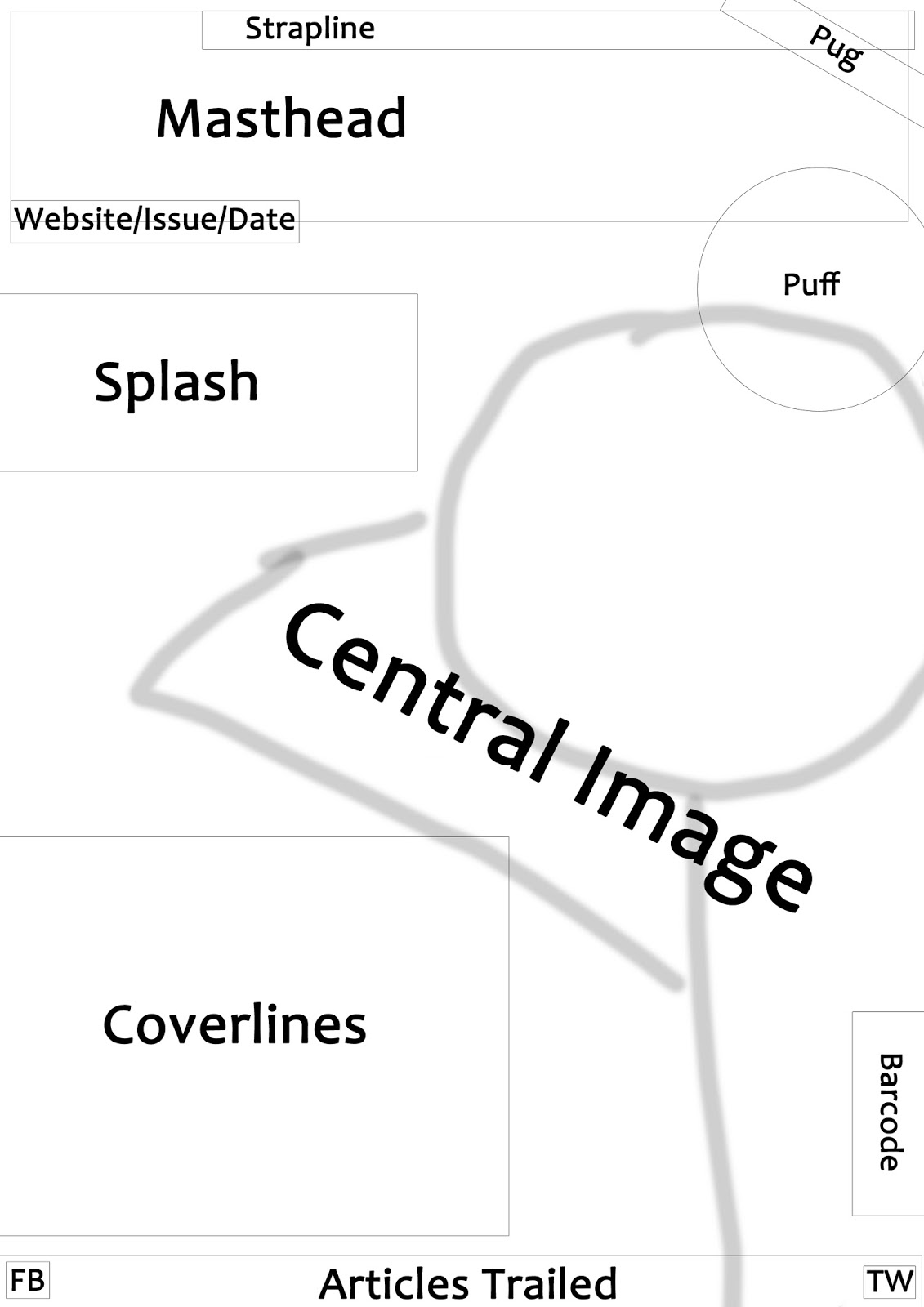
Style Sheet for Magazine

I have chosen these colours as they are bright like the genre of my magazine. I also chose the fonts as they are typically the style used in the genre.
Flat Plans - Double Page Spread
 |
| Flat Plan - Double Page Spread 1 The image in the middle means that more text will be needed to take up the blank space. I makes the page look more crowded that the other spreads. |
 |
| Flat Plan - Double Page Spread 2 The image to the left keep the page less crowded and allows for separate pull quotes around the blank area. The text of the article is able to be clearly set on the one page which will make it easy for the target audience to read through. |
 |
| Flat Plan - Double Page Spread 3 The image to the right makes it feel distant to the rest of the article. It is separated and doesn't seem as connected as the other image positions. |
Flat Plans - Contents Page
 |
| Contents Flat Plan 1 This plan keeps all of the secondary images out of the way to the side and keeps the contents all together in an easy to read straight down format. The central image is out of the way in he bottom corner but splits up the writing giving the reader a break in the text. |
 |
| Contents Flat Plan 2 The plan keeps the all of the images in a compact layout. It breaks the text up so it is separate. However the main image is very separate from the rest of the page. It does not work with the rest of the page very well. |
Flat Plans - Cover Page
 |
| Cover Flat Plan 1 The shot type allows all other elements to be positioned around the edge of the screen without obstructing the image too much. This type of image is used very often in my genre of magazine. |
 |
| Cover Flat Plan 2 The shot type only allows the elements of the magazine cover to be on the left side or else the image will be covered. However this allows more to be written in larger spaces to the left. This mage type is not often used in my genre but some magazines do use this image. |
Monday 2 November 2015
Time Management
5 Oct: Intro to task
Initial Ideas
Research chosen genre - Front Cover
12 Oct: Research chosen genre - contents and double spread
Develop Pitch
19 Oct: Pitch
Audience feedback
Style sheet
Planning and Production
2 Nov: Designing front cover
9 Nov: Designing front cover
16 Nov: Designing contents page
23 Nov: Designing double page spread
30 Nov: Develop design work in responce to the audience feedback
7 Dec: Finalise magazine design
14 Dec: Evalutaion Preparation
4 Jan: Evaluation
11 Jan: Evalutaion
Initial Ideas
Research chosen genre - Front Cover
12 Oct: Research chosen genre - contents and double spread
Develop Pitch
19 Oct: Pitch
Audience feedback
Style sheet
Planning and Production
2 Nov: Designing front cover
9 Nov: Designing front cover
16 Nov: Designing contents page
23 Nov: Designing double page spread
30 Nov: Develop design work in responce to the audience feedback
7 Dec: Finalise magazine design
14 Dec: Evalutaion Preparation
4 Jan: Evaluation
11 Jan: Evalutaion
Subscribe to:
Posts (Atom)